Gaya, Cosmetics
Gaya Cosmetics is an e-commerce platform focused on showcasing and selling beauty products through a visually appealing and accessible experience.
Background
Gaya Cosmetics once had a strong physical presence in Israel, with 10 stores operating between 2012 – 2019.
The brand gained visibility and trust through a well known presenter, Noa Tishby, alongside growing positive buzz between 2016 – 2018.
However, following the COVID 19 pandemic, physical branches were gradually reduced until they fully closed.
Today, only a single physical store is located in Moshav Udim a less accessible location for most customers.
My Role
My role was to redesign the user experience to improve product discovery, simplify navigation, and support more confident purchasing decisions.
The Problem
Behind the brand’s strong legacy, several critical gaps were identified:
● Performance in physical stores was significantly stronger than in digital channels.
● Business cash flow impacts the pace of inventory ordering, creating operational friction.
● Customers have been conditioned to expect promotions, reducing perceived value and profitability.
● A gradual decline in yearly revenue indicates a need for strategic improvement.
● The website suffers from a low conversion rate, failing to turn visitors into customers.
The Goal
Re-engage former customers who previously purchased in physical stores .
● Increase the current customer base.
● Scale revenue beyond the current average.
● Rebuild a strong digital channel that can replace the success of physical branches.
The Solution
A complete redesign of the digital experience focused on rebuilding trust, simplifying decisions, and increasing conversion.
● Create a clean, modern interface that reflects the brand’s quality and strengthens credibility.
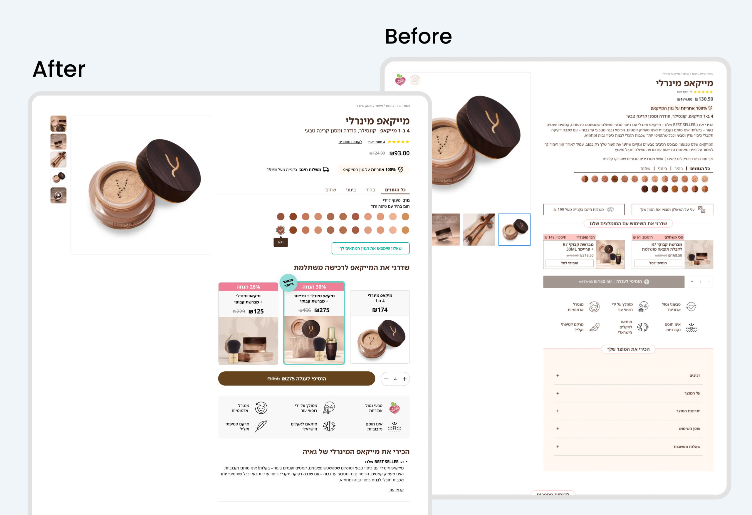
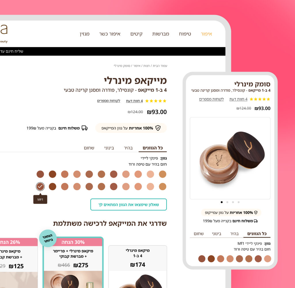
● Redesign the product pages to clearly communicate value and reduce cognitive load.
● Introduce strong and consistent social proof (reviews, ratings, user content) across key touchpoints.
● Implement a clear visual hierarchy to guide users toward primary actions (CTA driven design).
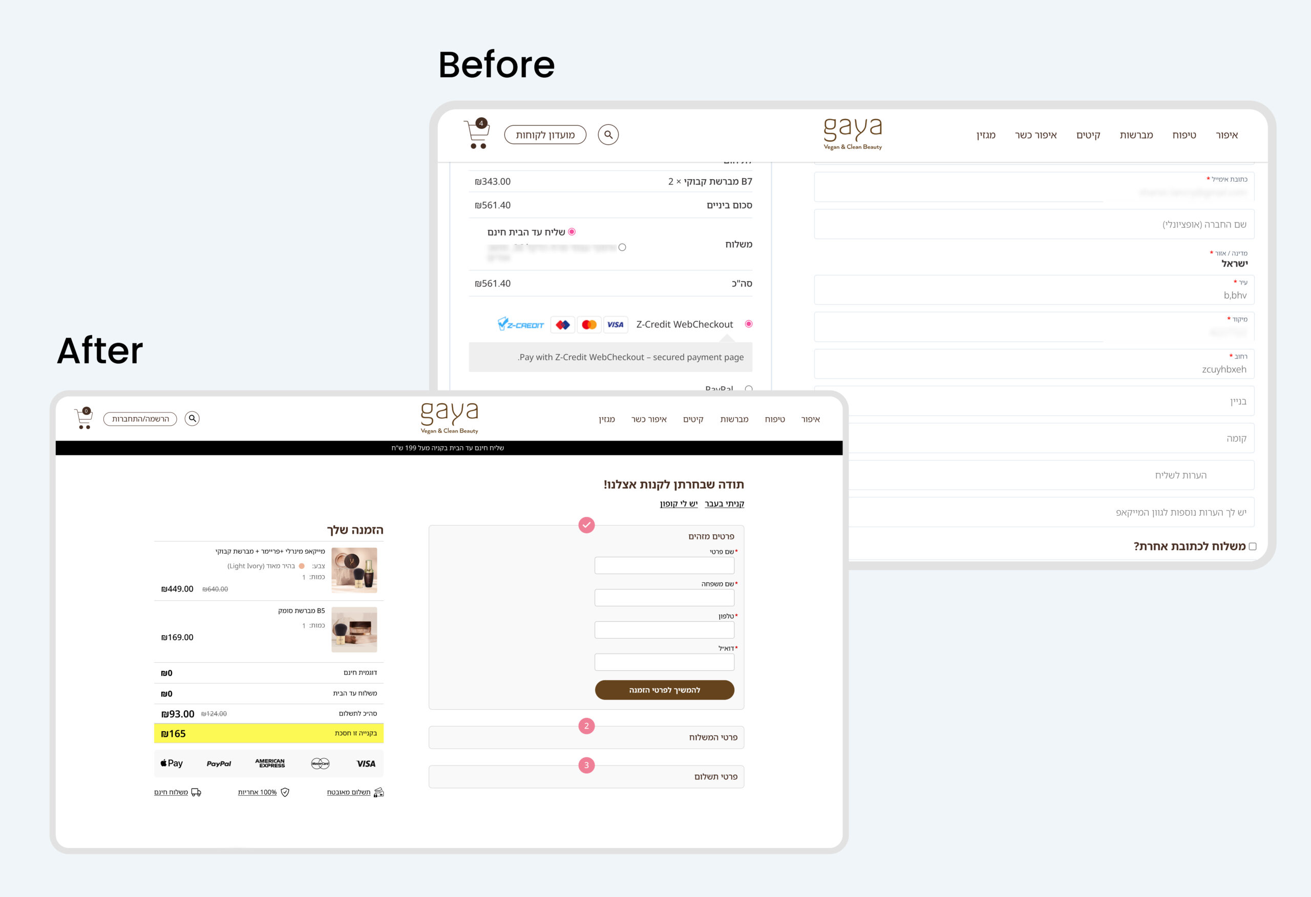
● Optimize the checkout flow with guest checkout, fewer steps, and distraction free experience.
● Keep users within the flow by replacing external actions with in-page solutions.
● Reinforce trust signals (secure payment, guarantees, transparency) throughout the journey.
● Adapt the experience to mobile first behavior, ensuring fast and intuitive interactions.
The Approach
Understanding the Current Experience
Explored the existing eCommerce platform hands-on, going through key user flows to better understand the experience from the user’s perspective.
● Tested core flows such as product discovery, product pages, and checkout.
● Identified friction points, confusion areas, and drop-offs in real scenarios.
● Gained a deeper understanding of how users interact with the platform end-to-end.
Stakeholder Alignment
Worked closely with the company to align on existing challenges and business needs.
● Conducted meetings to understand known problems and internal pain points.
● Aligned design decisions with business goals and constraints.
● Combined internal knowledge with user behavior insights to define priorities.
Analitics
Reviewed analytics data to better understand user behavior and define key problem areas.
Competitor analysis
Analyzed leading beauty eCommerce platforms to identify patterns, best practices, and opportunities for improvement