The Problem
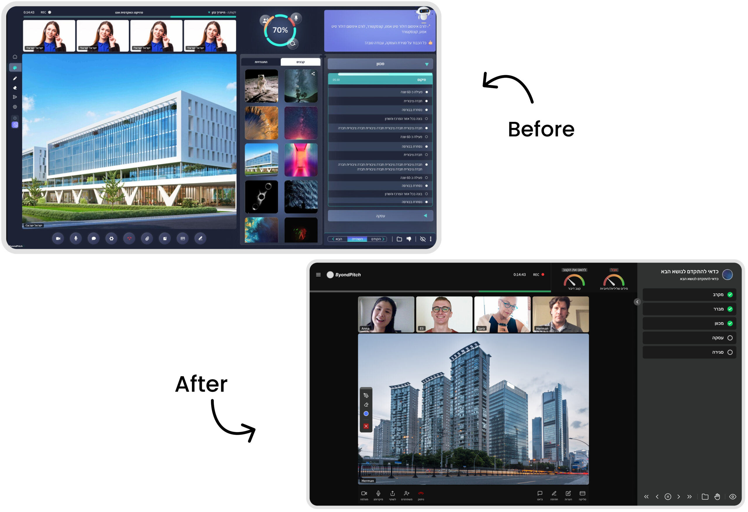
During live meetings, users experienced cognitive overload as they divided their attention between the video call, support tools, and guided instructions. An unclear information hierarchy, weak visual contrast, and a difficult to scan interface reduced usability and made it harder for users to complete tasks with confidence.
The Solution
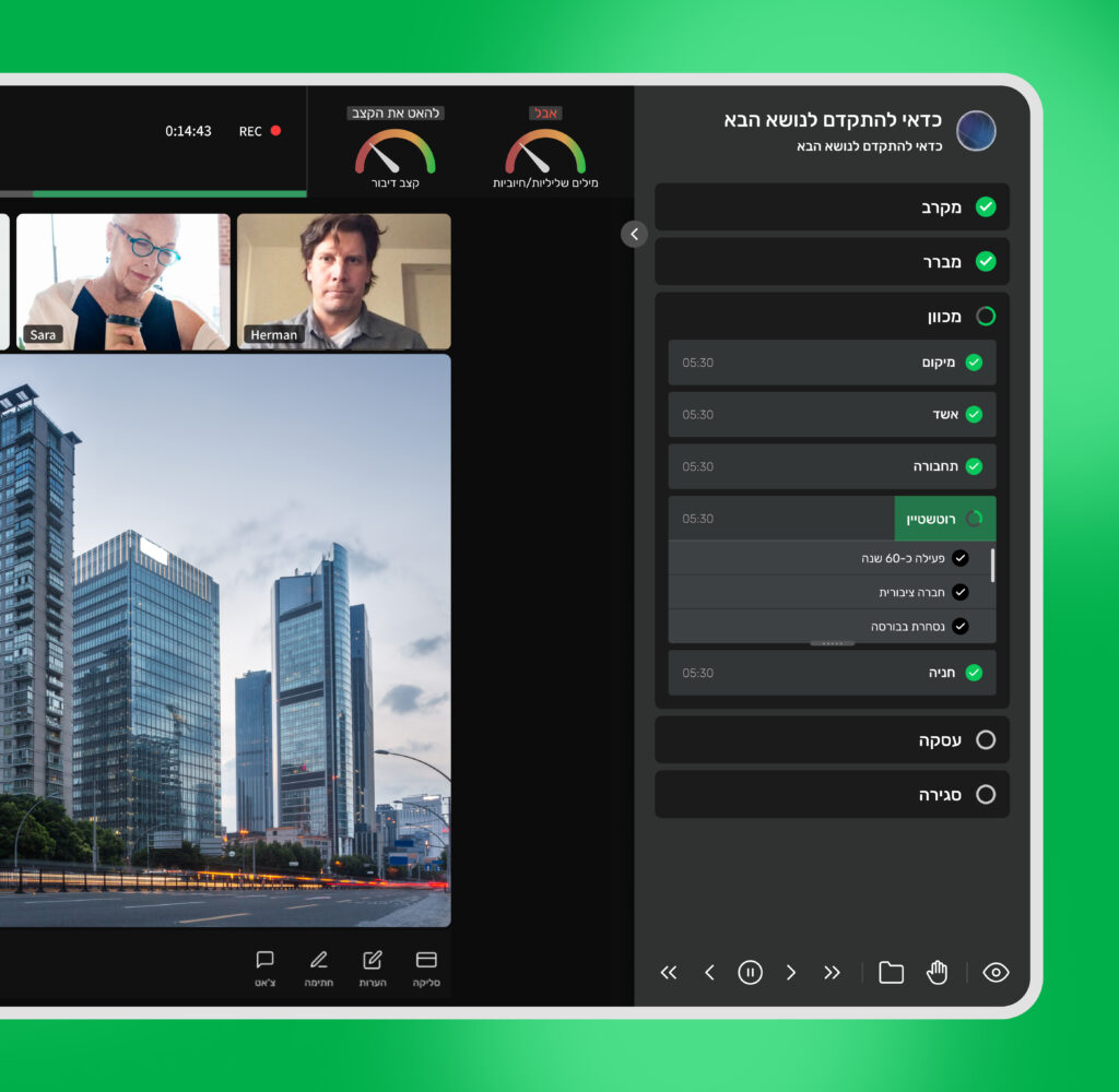
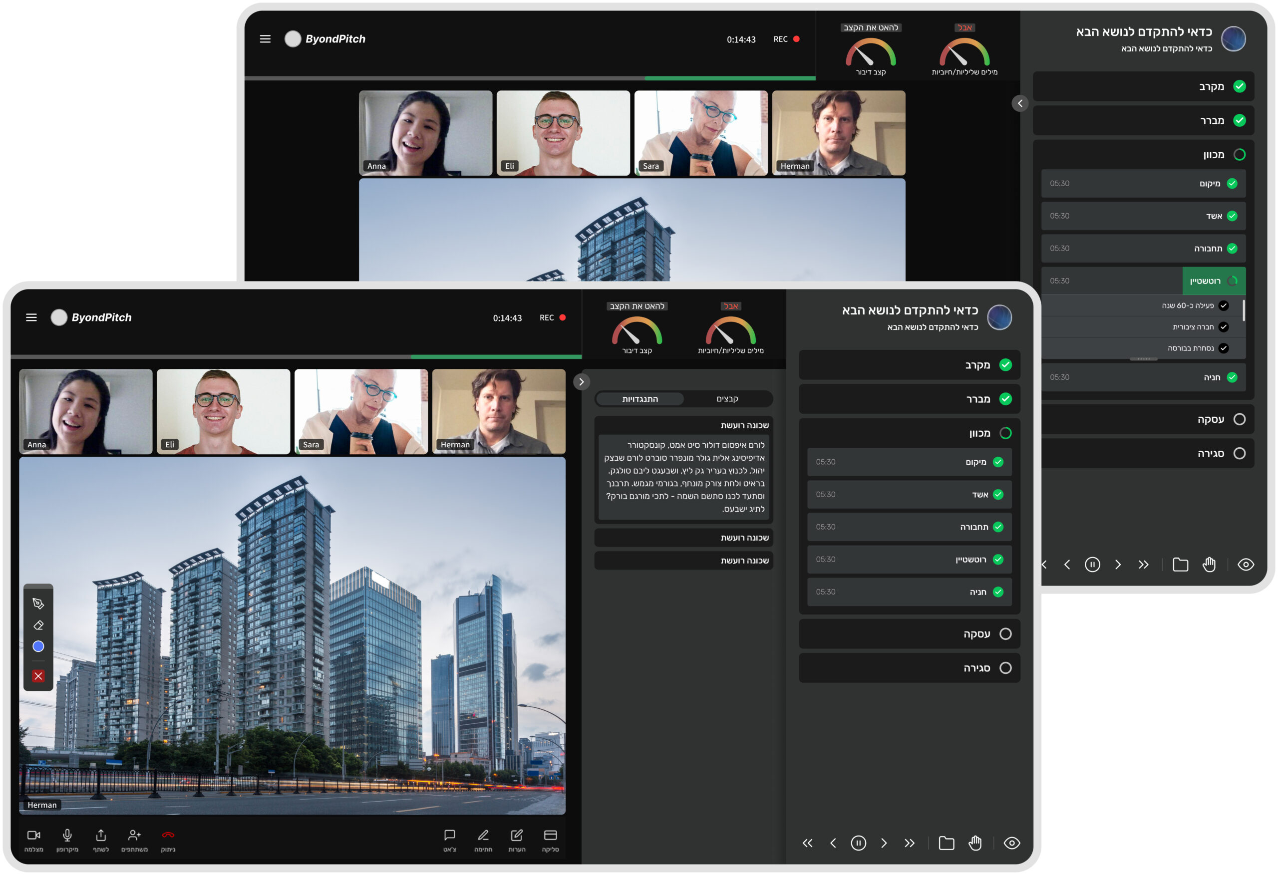
The redesign focused on reducing cognitive load and creating a more focused experience during live meetings. By simplifying the interface, improving visual hierarchy and contrast, and restructuring the guidance flow, the platform became easier to understand, allowing users to follow instructions while staying engaged in the conversation. The result was a simpler, more intuitive, and guided experience.
Key Insight
The main issue was not the amount of information, but the competition for attention between multiple elements on screen.
Users were constantly shifting focus between participants and content, making it difficult to stay engaged and follow the conversation.
The Approach
Understanding the Experience
We explored the platform hands on, going through real meeting scenarios to understand how users interact with the tool in live conditions and where friction occurs.
Stakeholder Collaboration
We held regular calls with the client to align on business goals, product constraints, and key areas of concern, ensuring the solution addressed both user and business needs.
User Feedback Analysis
We analyzed recurring complaints and insights provided by the customer success team, allowing us to identify the most critical usability issues affecting users.
Wireframing & Exploration
Multiple wireframes were created to test different layout directions and interaction patterns, focusing on reducing cognitive load and improving clarity.
Iteration & Refinement
Design decisions were continuously refined based on feedback and insights, leading to a more focused, intuitive, and user friendly experience.