The Need
Recruiters struggled to efficiently manage large volumes of candidate data due to a lack of clear structure and prioritization.
Key information was scattered across multiple sections, forcing users to spend time searching instead of making decisions.
This resulted in slower workflows, increased cognitive load, and difficulty focusing on the most critical actions during the hiring process.
In high volume hiring scenarios, this significantly slowed down the recruitment process.
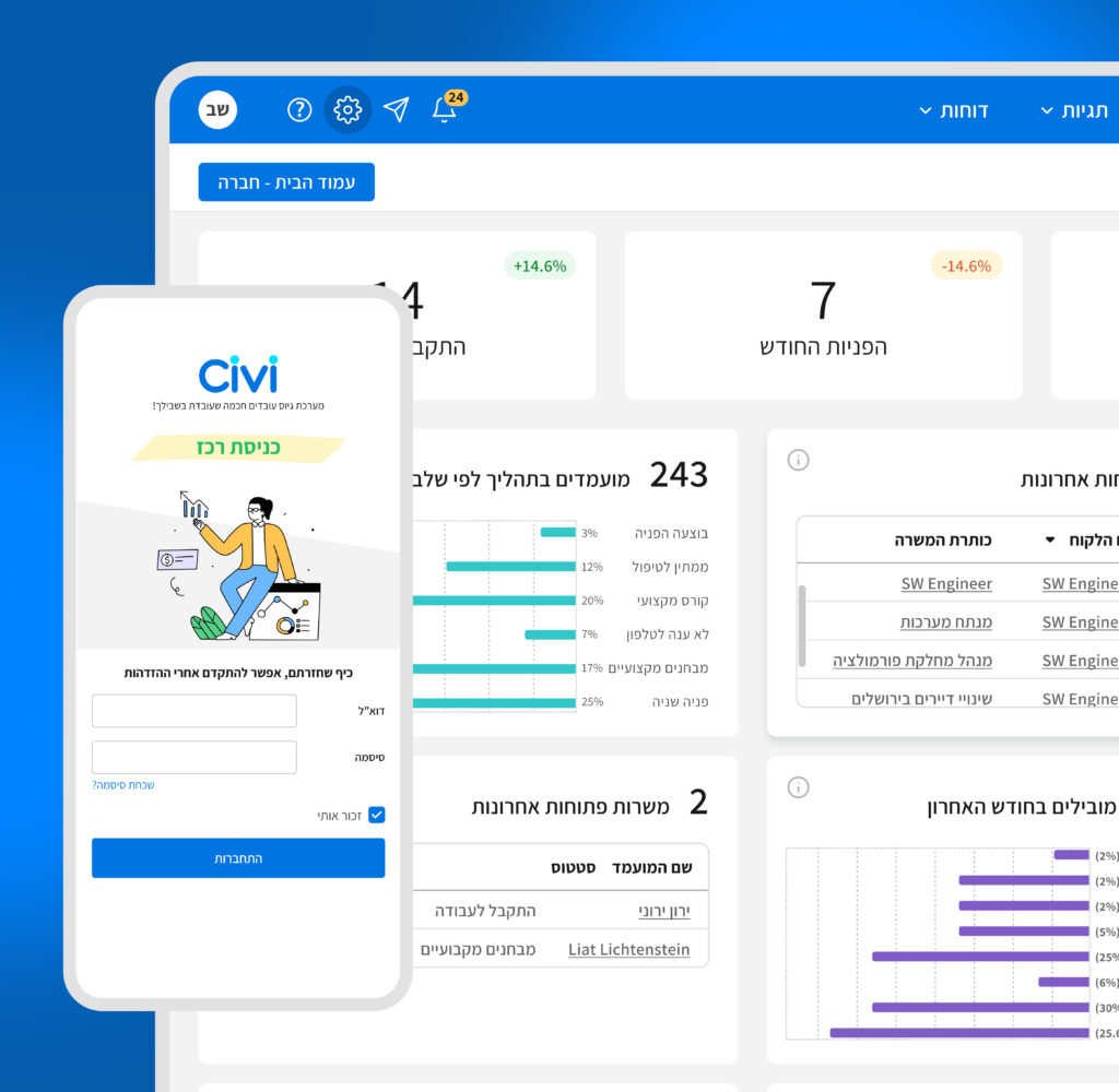
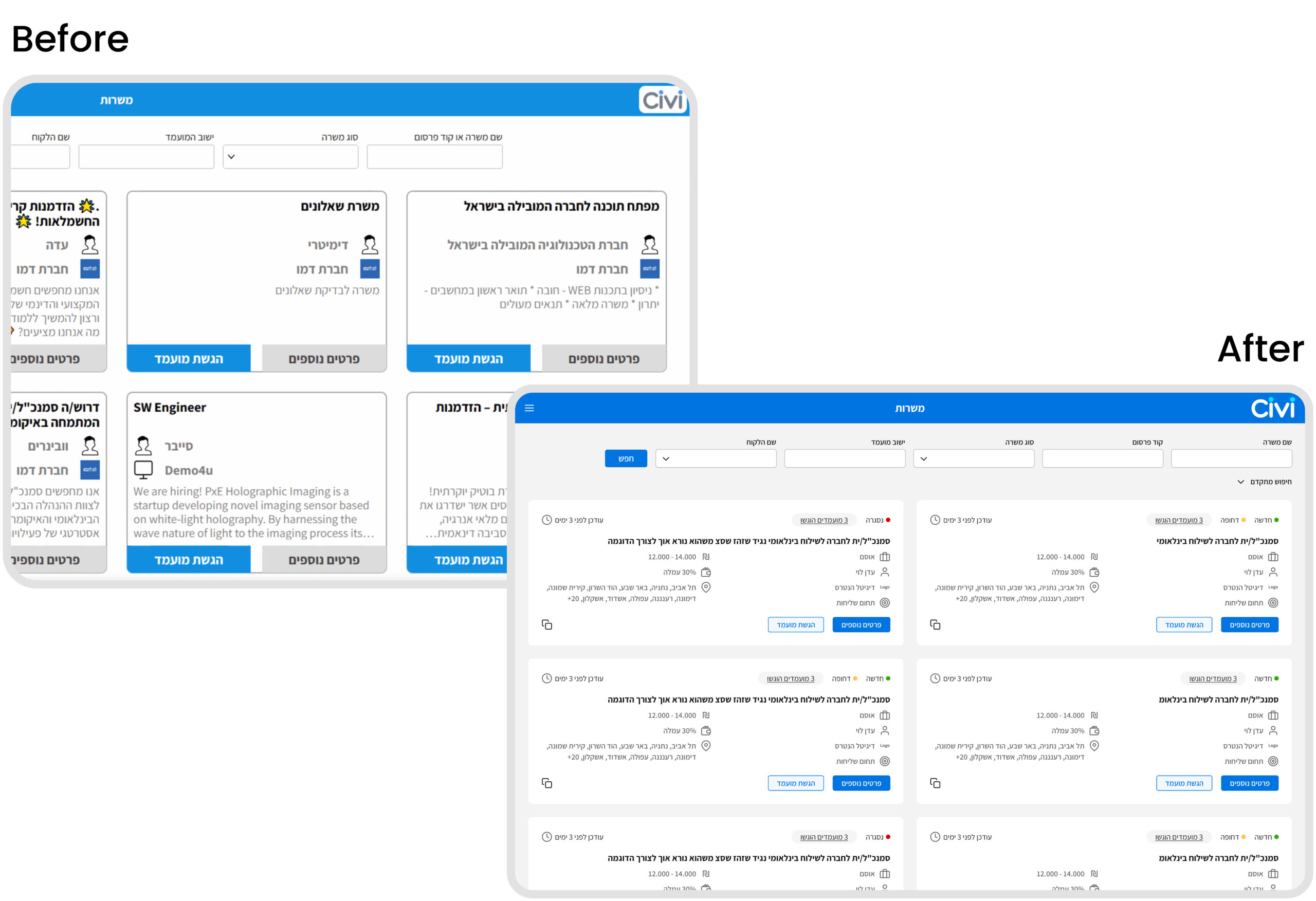
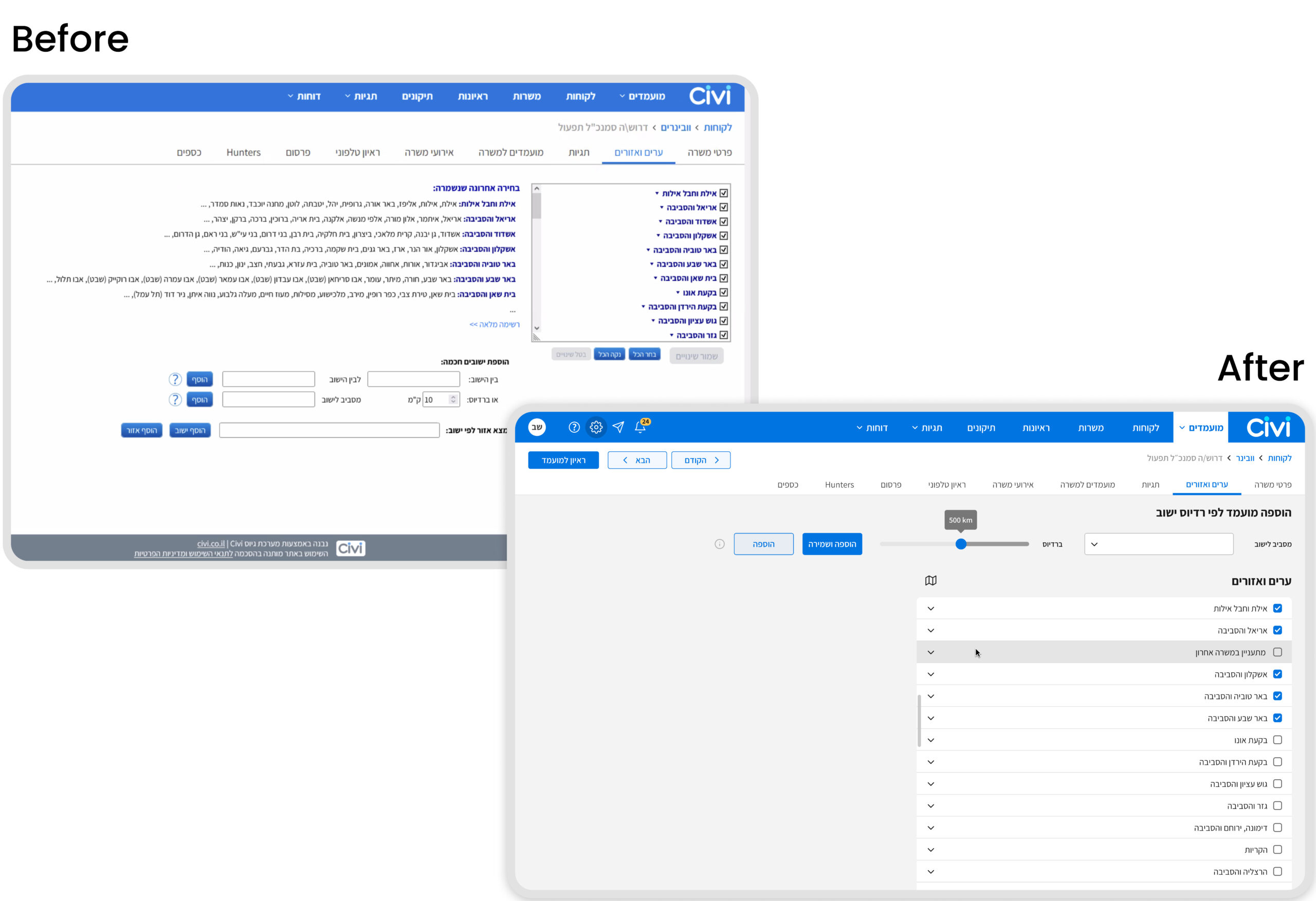
Bring the system to a current appearance that will attract new customers, retain existing ones, and make the stunning value the product has to offer intuitively accessible.
Productivity, corporate communication, data control, AI, comfort, and more.
The Solution
The solution focused on restructuring the platform to simplify complex recruitment workflows and improve decision making.
I redesigned the information hierarchy to help recruiters quickly identify key candidate data and take action without navigating through multiple sections. By prioritizing the most frequent recruiter actions and reducing the visibility of secondary ones, the interface became more focused and easier to use at each step.
One of the key insights was that recruiters were not overwhelmed by the amount of data, but by the lack of clear prioritization. The redesign therefore focused on guiding user attention rather than simply reducing information.
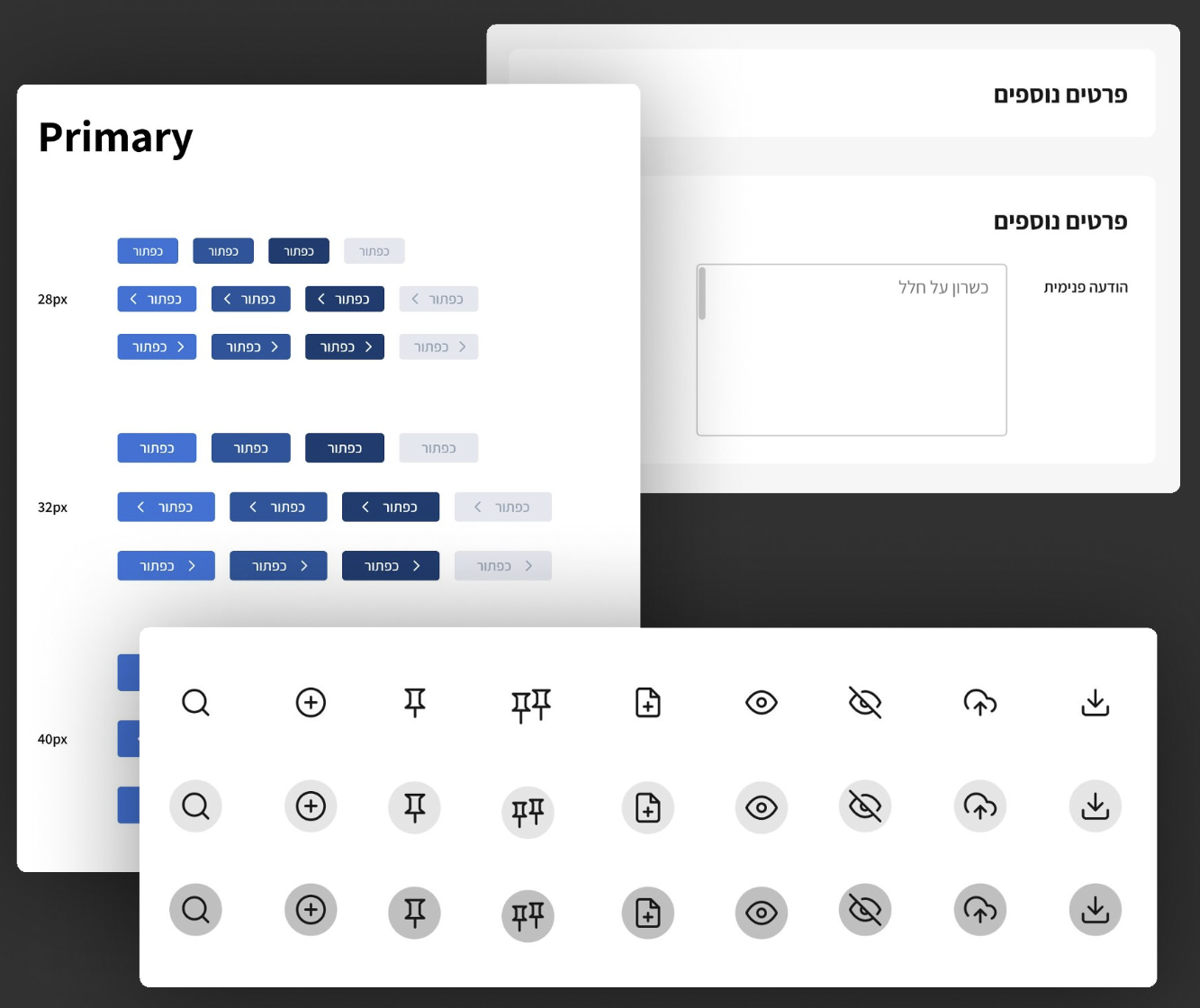
In addition, I redesigned the design system to create a more modern and cohesive visual language, improving clarity, strengthening user trust, and supporting both user retention and acquisition.
1. Handling the navigation system.
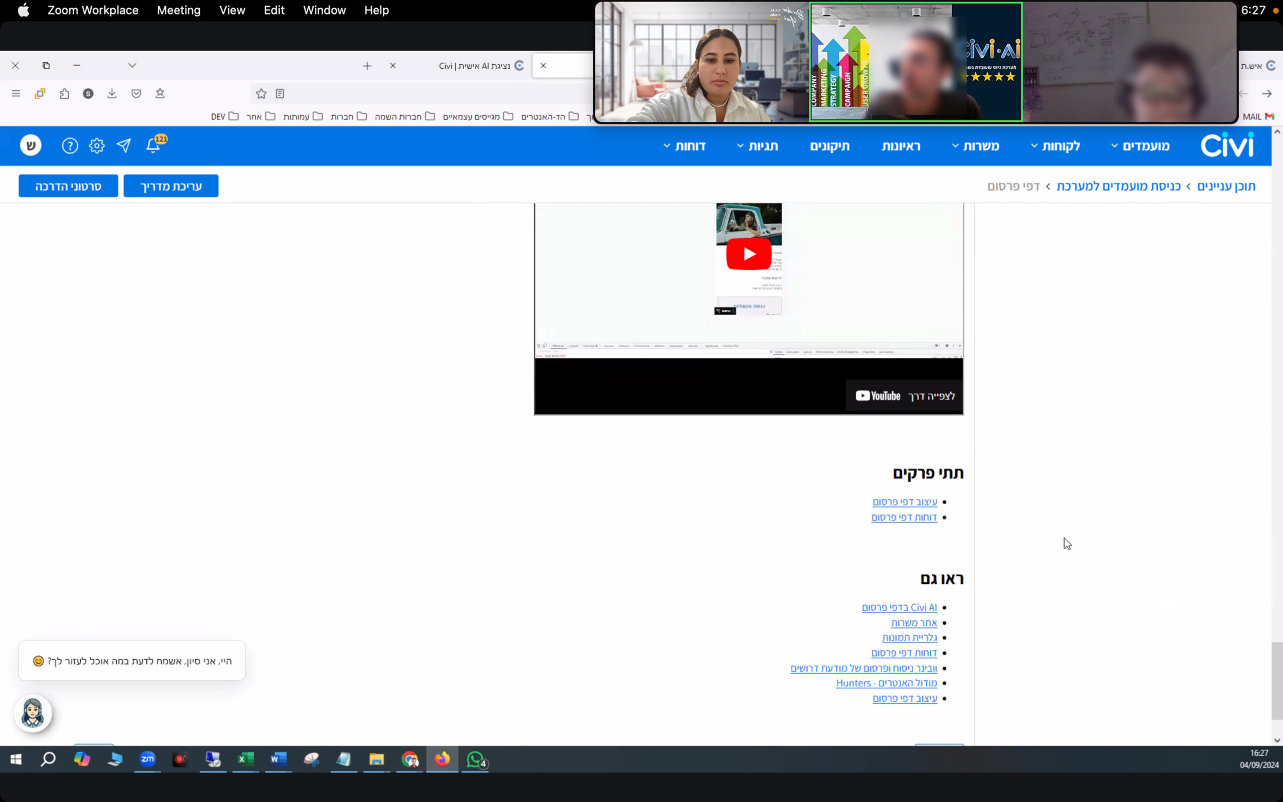
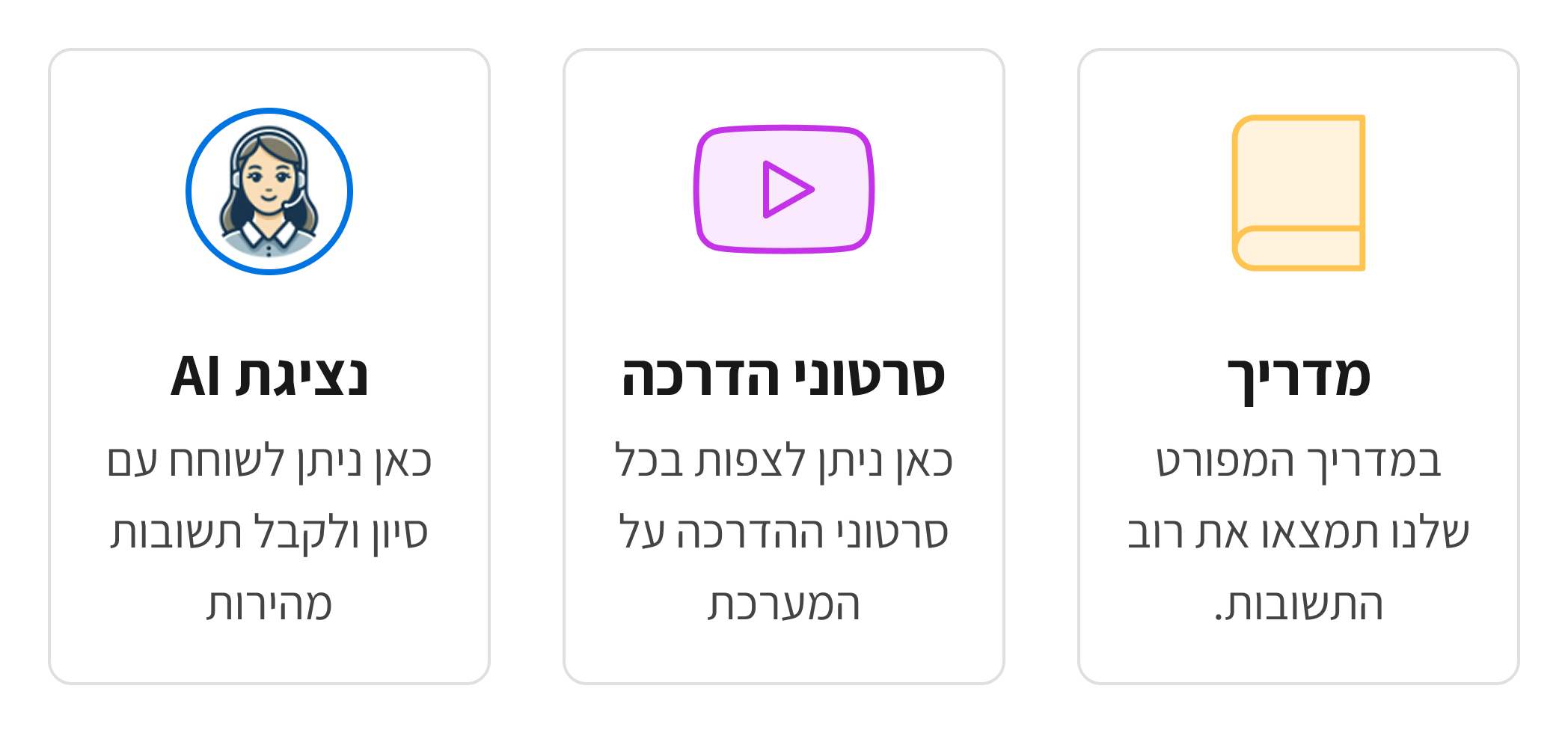
2. Make the guides accessible.
3. Irrelevant information out, relevant In.
4. Reducing actions in each flow.
5. Visually appealing.
6. Removing clutter in tables.
The Approach
Starting from analytics
A critical step in connecting real pain with life-changing solutions.
Exploration
Pilot, work on one main page and understand how much UX/UI can contribute. Created multiple wireframes to explore different layout structures and information hierarchy.
Iteration
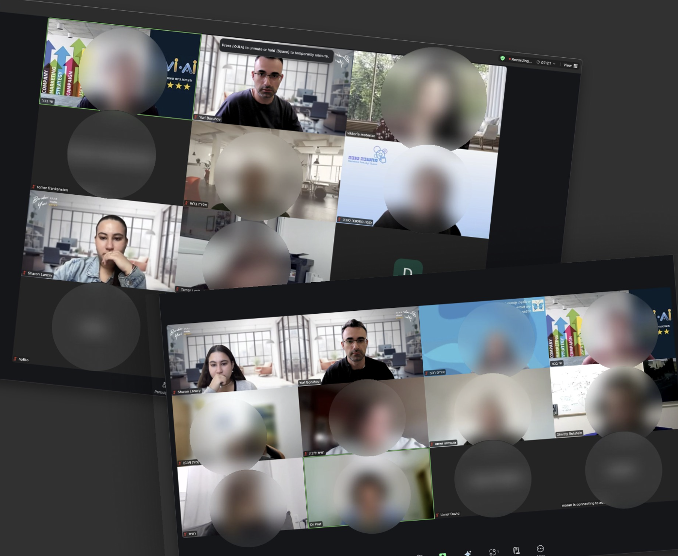
Worked closely with the client and team to refine flows based on real use cases.
Validation
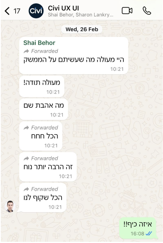
Used feedback loops from stakeholders and users to ensure usability improvements. Main flow, examine "bumpers" that prevent a smooth experience.