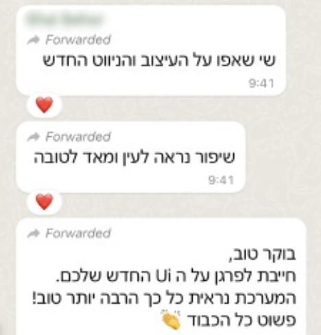
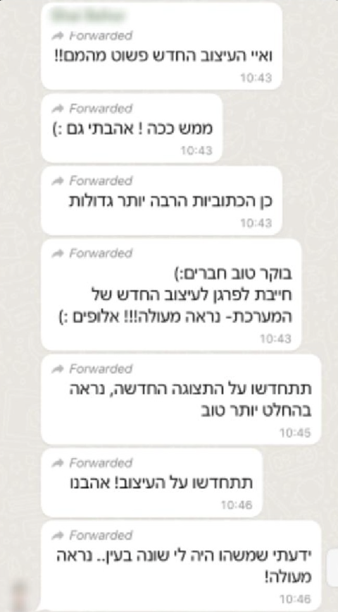
The Need
Attract new customers, retain existing users, and make the product’s value easier to discover and use.
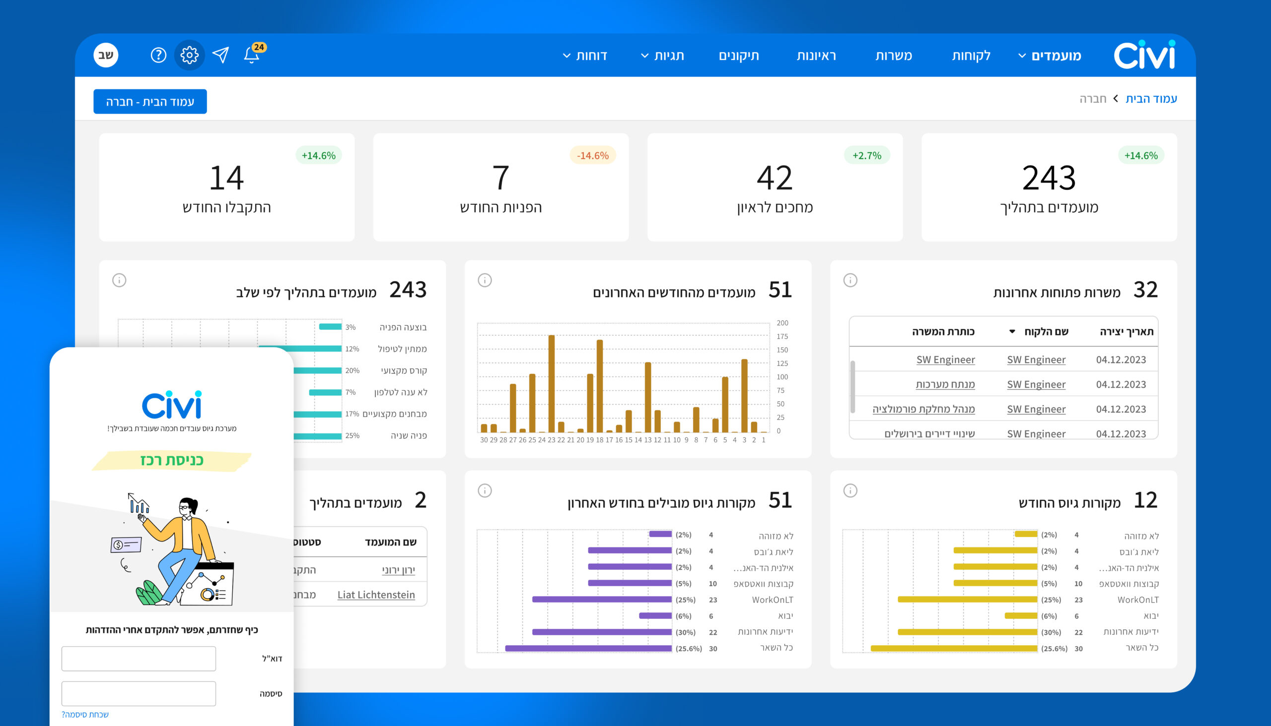
Modernizing the system with a fresh, intuitive experience that attracts new customers, strengthens engagement with existing users, and makes the product’s value easier to discover and use.
By improving usability, visual clarity, and overall experience, the redesign supports productivity, seamless communication, smarter data management, AI-powered workflows, and a more efficient way of working.
The Solution
The solution focused on restructuring the platform to simplify complex recruitment workflows and improve decision-making.
I redesigned the information hierarchy to help recruiters quickly identify key candidate data, prioritize relevant information, and complete tasks with fewer actions. By improving the navigation system, reducing table clutter, and removing unnecessary information, the experience became more focused and efficient.
The redesign also focused on guiding user attention by making important actions and guides more accessible, helping recruiters navigate the platform with greater clarity and confidence.
In addition, I redesigned the design system to create a more modern and cohesive visual language, improving usability, strengthening user trust, and supporting retention and acquisition.
The solution focused on restructuring the platform to simplify complex recruitment workflows and improve decision-making.
"Cities and Areas"
The Challenge:
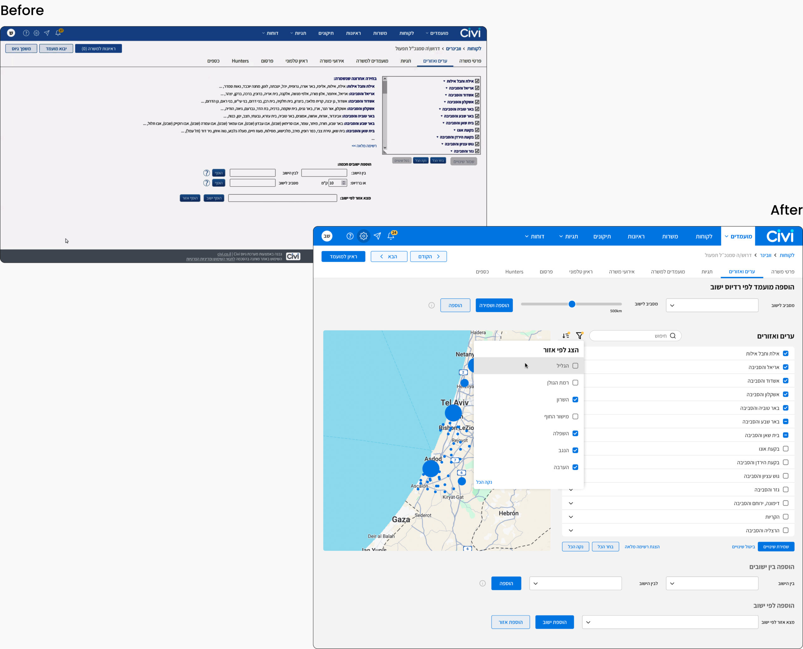
An overwhelming, manual process made finding the right cities and areas time-consuming and difficult.
This screen allows recruiters to target candidates based on their location, selecting relevant cities and areas when distributing job openings.
To simplify the experience, we introduced search, filters, and an interactive map, giving recruiters multiple ways to quickly find and select the locations they need. We also improved the information hierarchy and visual organization to make the screen easier to scan and understand.
The redesign transformed a manual, overwhelming workflow into a faster, more intuitive, and flexible way to target candidates by location.
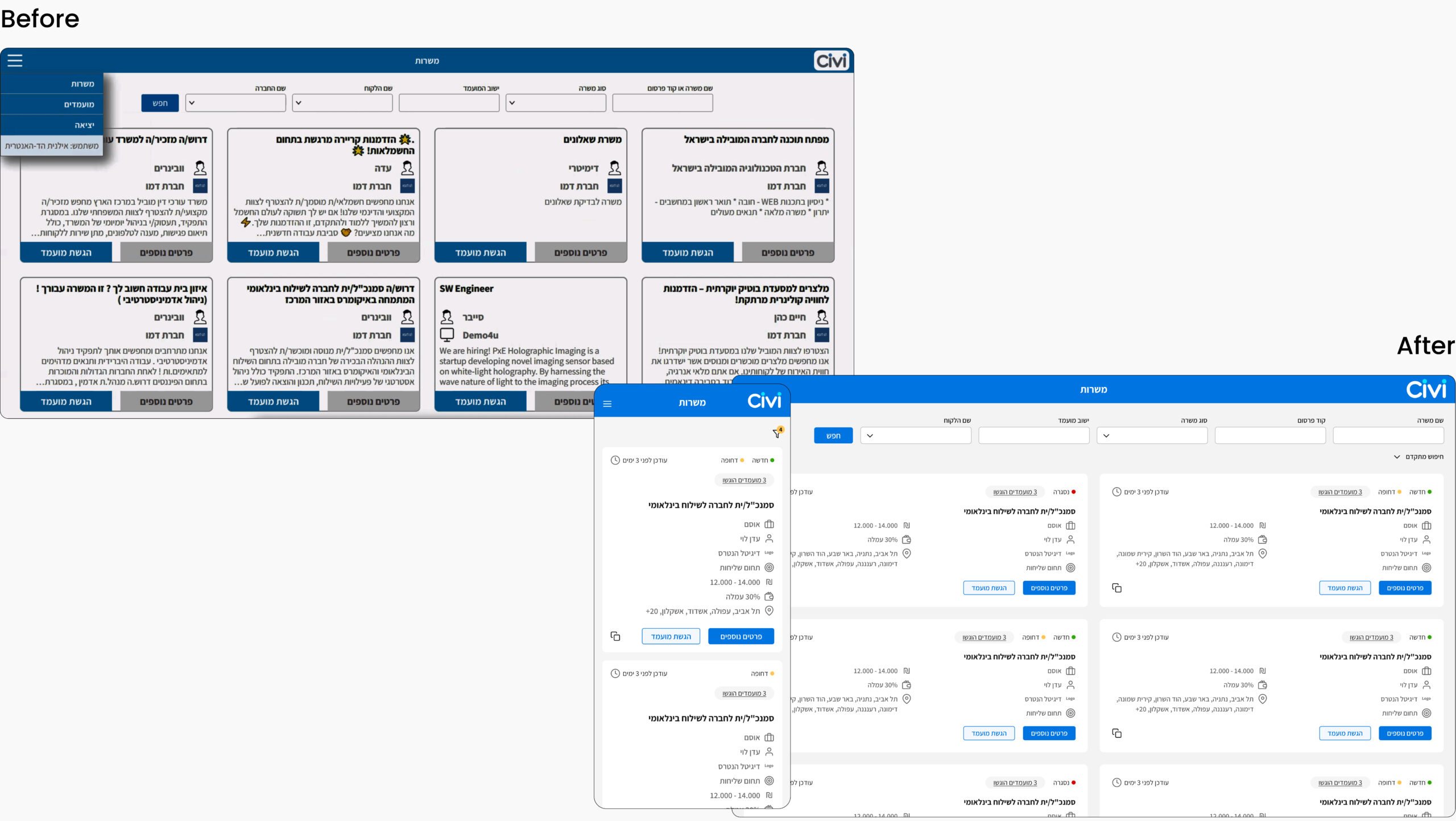
"Open Jobs"
This screen displays all available job openings in one place, requiring users to quickly scan and identify relevant information before deciding whether to access a specific job opening.
Through user research, we analyzed which information recruiters needed to see at a glance and which details should remain inside each opening. This helped define the right information hierarchy, reduce unnecessary data overload, and create a more efficient browsing experience.
Selected Screen Overview
Selected Screen Overview